Brand Design: Clever Clothes for Creative Kids
Nothing makes us more proud than when one of our visual brand designs is introduced to the world. We began working with innovative kids clothing brand Mitz last November, and were cheering them on when they recently launched their streamlined new brand.
From simple accessories to a full-blown line of durable kids clothes, Mitz has changed and grown by leaps and bounds in the past 2 years since first launching their successful Kickstarter campaign, and needed branding that reflected their new mission and core product offerings: imaginative, education-focused designs that are free of gender stereotypes and comfortable for playing, jumping, climbing, and roaring.
(See? Roar!)
We began our process as we always do — by asking the Mitz founders to fill out our detailed Discovery document, followed by several conversations about their goals for both the branding and the future of this young business. In the case of Mitz, they came to us for both visual branding design and help honing in on their overall brand messaging and tagline, which has slowly been evolving over the last two years.
Behind the scenes, the Curious team worked collaboratively to create one solid design concept that showed several design assets right from the start, to help the Mitz founders see the big picture of their new brand. We also presented their refined brand messaging in the first proof round to clearly illustrate how both the voice and visuals of the brand go hand in hand.
When we first present a concept to a client, we ask a few questions to help guide their feedback and ensure a productive creative process. In this case, we could not have asked for a better response to our first question:
Do you feel that this design concept reflects your brand and speaks to your target customers?
Yes, we absolutely believe this design concept reflects our brand and speaks to our target customers. The color choices and fonts reflect the balance and level of sophistication and approachability we wanted to strike. We especially like the use of the color navy in the palette. The brand itself feels much more kid-focused in this design.
Throughout our continued conversations and collaboration with the client in two additional proof rounds to refine and finalize our work, together we landed on their new tagline — Clever Clothes for Creative Kids — that is the perfect match for both the clever owl in their new logo (whom we affectionately refer to as Mitzy) and their thoughtfully designed clothes for kids.
Beyond the logo, we created many assets for the Mitz team to use in their branding, including secondary marks, accent patterns, business cards, and garment hang tags — all incorporating their flexible new color palette, typography, and brand standards.
We also created website assets to update their existing Shopify site, while helping to guide them on other stylistic changes (fonts, colors, buttons, etc.) to maintain a consistent aesthetic across the board. This included homepage revisions, where you'll see some of the playful secondary marks in action:
... and individual page category headers:
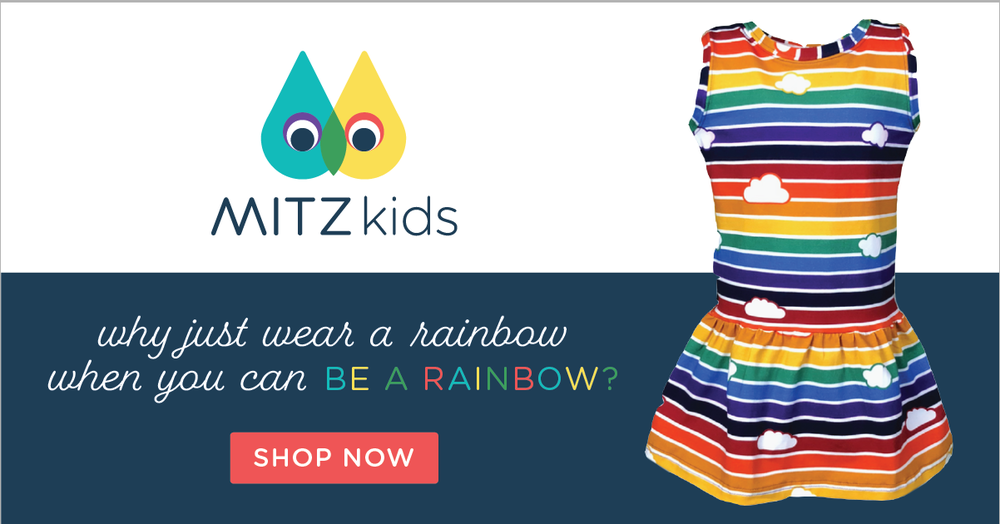
Additionally, we created templates for their ongoing marketing needs, such as Pinterest-ready layouts and Facebook ads to reach their target audience.
It is so exciting to see all of the elements come together, and have a part in the growth of small businesses doing big things.
Does your visual brand truly reflect your business? We love working with business owners to define their unique voice and create a visual brand that clearly communicates that message, connecting them with their target audience through the power of good design. Could your logo & visual brand be doing more to connect you with your target audience?Lets chat!


